Kevin and Me
Maxxon
Before we begin, I should note that since this article is all about painting and other minute
details, I linked each picture to its zoomed version. Just click on the pictures
to view the extreme close-ups in a separate window.
Introduction
 While I'm old enough to remember Foundry before
Kevin, the two have become rather tightly associated
lately. I've always been fascinated with Kevin's signature three-color style but for a long time
I thought it was just one of those things I couldn't do, like blending or painting neat eyes.
While I'm old enough to remember Foundry before
Kevin, the two have become rather tightly associated
lately. I've always been fascinated with Kevin's signature three-color style but for a long time
I thought it was just one of those things I couldn't do, like blending or painting neat eyes.
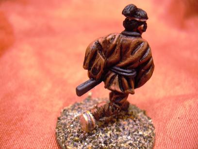
I had tried the three-color style every now and then, but without much success as this picture proves.
I even got the flesh palette from Foundry, but mainly because I wasn't satisfied with the flesh tone
paints I had at that time. The paints were good, but I didn't really get the hang of the three-color style.
Then Kevin wrote a book...
The Beginning of... Something
I figured I'd buy the book just for the pretty pictures (like most of the
Osprey titles I own). So I placed a pre-order and sat
waiting. But the thought of actually doing three-color stuff kept nagging me and finally I tried to paint
a few figures in that style.
Well, it took no genius to see the results weren't that hot. Something was missing, but I couldn't
quite figure out what. Bravely I posted these pictures on TMP
and fellow members jumped to rescue. Especially Matakishi
was extremely helpful, explaining the procedure and pointing out my mistakes instead of snapping off a
CMoN -style one-liner like: "Thin your paints more."
One Small Step for Mankind, One Giant Leap for Man
Emboldened by the feedback, I took the splurge and called Foundry to amend my order. Bernard was a bit taken back
when I told I wanted to change it, most likely he was expecting me to tell the missus had orderd me to cancel such
frivolity, but once I mentioned I wanted more stuff added to the order, he promptly recovered and assured all would
be taken care of.
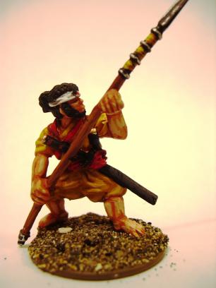
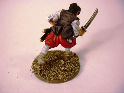
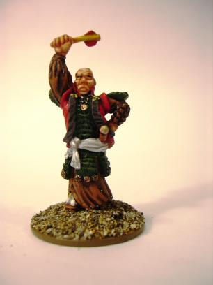
But could I wait? Noooo... I just had to have a go at it. It just happened I had had a bunch of
Dixon samurai sitting around my
desk for quite some time. I decided that these would become the test subjects. The first few were primed long time ago
in black just like Kevin suggests. I did have the Foundry flesh palette, but otherwise I was restricted to my old
and faithful Miniature Paints, some very
old leftover Citadel paints (when they still had the same pots Foundry uses now) and my largely underutilized
Vallejo Model Color paints to work with.
This meant that I only had pre-mixed shade and highlight colors for the skin. I decided I'd stick with the style for
the skin and do the other parts as I saw fit.
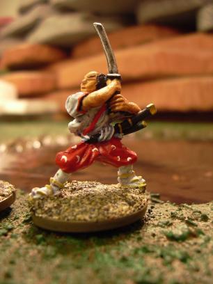
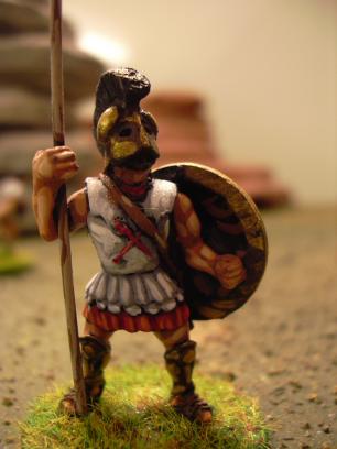
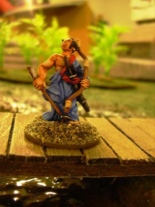
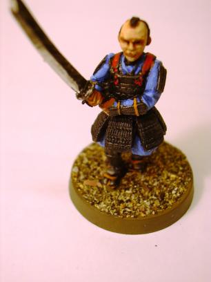
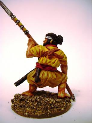
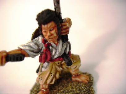
As you can see, the blue robe is spoiled by the too stark contrast between the shade and the highlight colors. On the belt
of the leftmost figure it isn't that bad - mostly because the belt area is so small.
The Theory
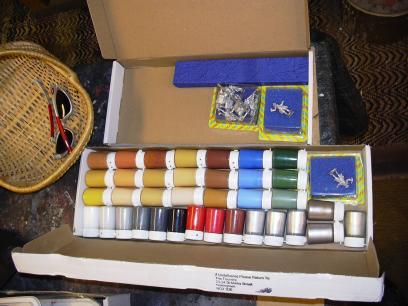 Soon after that my starter deal arrived. For some reason, I even got two copies of "Kevin the Painter" figure. Not that I
mind getting free figures. I also got a set of brushes which I hadn't really counted on, but whattaheck...
The retro-style pots brought back memories of my early days in the hobby...
I grabbed the book and started reading.
Soon after that my starter deal arrived. For some reason, I even got two copies of "Kevin the Painter" figure. Not that I
mind getting free figures. I also got a set of brushes which I hadn't really counted on, but whattaheck...
The retro-style pots brought back memories of my early days in the hobby...
I grabbed the book and started reading.
Now, I had read Kevin's various painting articles in Wargames
Illustrated, but quite frankly, they just hadn't clicked. I was mildly disappointed to see that his book reprints
quite a few of those articles, but the gorgeous pictures made it seem a worthwhile purchase anyway.
But upon closer reading, the thing seemed to click together unlike ever before. I'm not entirely keen on everything
Kevin suggested, like using oil colors for horses (I'm quite comfortable with ink and acrylic washes and drybrushing
large areas) or varnishing with gunk scooped from stockpiled vintage pots obscure polyurethane varnish. The less solvents
I need to sniff, the happier man I am
(in the long run, anyway).
But the basic process of the three-color style seemed much clearer now. I would attribute this partly to the one-color and
two-color sections using the same figures. In my mind, these would better show how the coloring progresses. The other great
thing was the huge larger than life photos of the miniatures. Many people say that miniatures are not meant to be viewed
that way, but in my opinion being able to paint figures that can be enlarged tenfold and still look good is just awesome
("Happamia, sanoi kettu").
It's like detailing engine on your car model kit: you could argue that no one ever pops the hood to check, but in your heart
you just know you cut a curner - the model is not as perfect as it could be. Modeling is a hobby for us
anal retentive perfectionists...
But one of my problems with the three-color style has always been that I can't draw. Consequently, I can't mentally picture
where shadows and highlights fall. Seeing the hugely enlarged photos where I could see every brush stroke really
helped me on this. I could literally copy the brush strokes.
The other problem is that I just don't seem to be able to pick right shade and highlight tones. I had become practiced with
washing and drybrushing, but actually painting in the highlights is much less forgiving. This is why I decided to splurge and
buy the Foundry paint set: All colors pre-mixed for me. Maybe Kevin can tell if
Dusky Flesh 6B goes with
Buff Leather 7A, but I sure can't.
The Practice
By this time I had exhausted my supply of previously primed samurai models. I dug up the rest and cleaned the models, but
then I diverged from Kevin's guidelines. Yes, I know. Here I am, trying to find out if the master's teachings are good for
me and then I disregard his sagely advice and prime in white of all things. You see, I had tried gesso for priming
and really liked it - no more smelly spray, no more spray all over the place, no more sneezing black crap after a priming
session, no more spray, period! The only problem was that my giant one liter tub of gesso was white.
So, white they were. I tried inkwashing a few to bring out the lines, but the gesso sort of sucked up the ink and it never
really gathered in the recesses. Oh well, doesn't matter I thought and went at it. White undercoat really does make this
style of painting harder. Even if you're not into blacklining, there are bound to be some hard to reach nooks on the miniature.
In a wash-based style, the washes will enter these and leave a dark shade. In the three-color style, you have to actively put
paint on every bit unless you want the undercoat to show. A black undercoat showing in deep recesses is okay - white isn't.
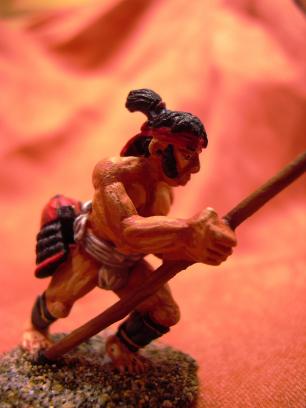
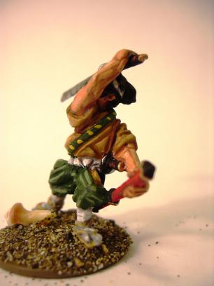
I'm relatively happy with the results... except I cheated. I was thinking of something else and squirted too much brown
paint from a Vallejo bottle. Unable to use it all on the intended subject, unable to put it back in the bottle and
unwilling to let it go to waste, I used it on the clothes of the brown guy. Now, faced with a color I didn't have a
proper three-shade palette for, I inkwashed it. But the final highlight is painted, I think it was actually one of
the spearshaft colors.
A Quickie On The Side
Even though the three-color style has been perhaps faster in terms of absolute time, as there is virtually no waiting
for paint or ink to dry, I found the style slower overall. Maybe just because I'm still learning it, maybe because
I'm overdoing it and three-shading every small detail. But that's the impression so far.
To see if I could paint it faster, I grabbed two Clan Wars troopers from the basic box graciously donated to me
by a friend of mine (ok, he got a bunch of genestealers out of the deal).
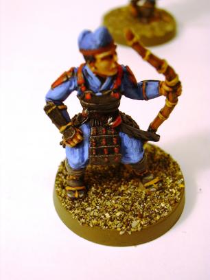
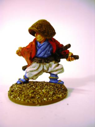
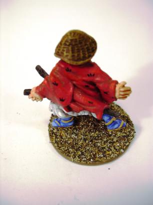
I started doing a simple black base drybrushed silver for the armor, but then I realised that while this is ok for
the archer's armor, the swordsman actually has an earlier style of armor that has scads of silk lacing visible.
This is a very classic and beautiful armor style, but it's also a royal
female canine to paint.
I did try, though, but even with the very finest Foundry brush (I think it's 5/0 but for some reason they don't
print the numbers on the handles) it was simply beyong my abilities. You can spot similar lack of precision if
you look closely at the cord bindings on the spearshafts and similar things. I guess old age is getting to me finally.
Finally I just gave up trying, re-painted the area black and drybrushed it in dark grey.
Black silk
is always in fashion, damn it!
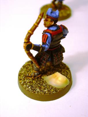
I'm pretty happy with the blue (except on the hat, lack of precision again), but otherwise these are a bit bland. On the
other hand, they were maybe twice as fast to paint as the other samurai in here. If you look closely at the legs, you'll
see that I tried to combine the black and white palettes to generate dark grey, but the final highlight from the white
palette is too light. Gotta stick with the official colors.
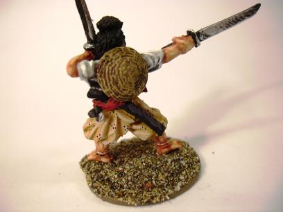
More Practice
In the book Kevin mentions having once painted a whole bunch of horses as a sort of "kill or cure" to learn to paint
the oatmotors. I didn't have quite as many samurai left, but I persevered. I think I was getting better doing the
faces. Ironically, I was beginning to see the clothes with lots of heavy folds these figures have as harder to do than something
with less sculpted-in folds. While the folds do act as guidelines for placing shadows, they also force you to
put shadows and highlights in certain places. The resulting figures look a little busy in my opinion.
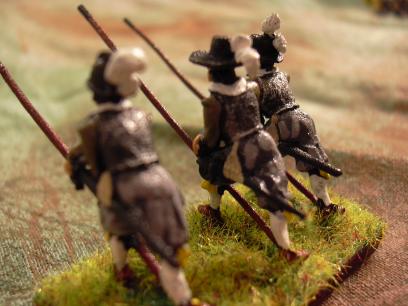
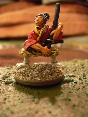
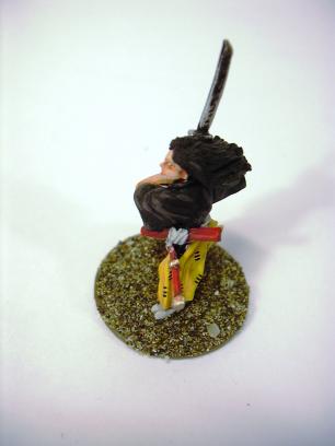
I tried to use two similar but different tones on the spear-armed samurai. The shirt is Ochre while the pants are
Buff Leather, but the colors are a bit too close and you can't really see the difference in these photos.
Out Of Samurai Error
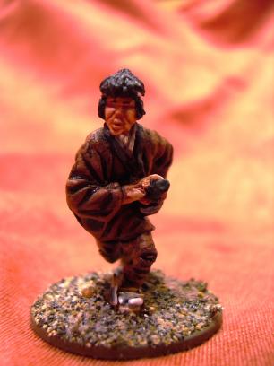
All things end, and so did my batch of Dixon samurai. I put a little extra effort into these final ones, including
some patterning done with a technical pen. This is actually really easy to do, as long as you keep to simple dots
and dashes placed randomly around the garment.
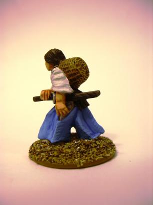
I guess I should mention all the straw hats above are actually drybrushed and painted with Miniature Paints to
boot.
Final Thoughts
 Final in the sense that this article is finally finished.
On The Book
The book is, in my opinion, well worth the money. It is not perfect, there is a fair bit of repetition and some
parts have been previously published. What I find strangest, though, is that glosses over some stuff pretty completely.
Washing is mentioned only very briefly, glazing and blending neglected completely...
Still, I would have to rate this book as the best guide for painting miniatures that is written for non-artists.
On The Starter Set
The starter set is even better deal, assuming you don't already own a lot of Foundry paints. To be pretty blunt,
I'd have never ordered brushes from Foundry if they hadn't come "free" in the set. But actually they are good
brushes and unlike my old painting style, three-color really needs those good quality teeny weeny brushes to be
successful.
I have to say I wish they did something between buying the whole set and individual colors. Like a collection of
greens, a collection of reds, a collection of blues etc. With the starter sets, you're buying the flesh tones
and a number of other common colors over again. The full set is pretty expensive, and you're buying everything
in your starter set over again. Individual colors add up quick, making you think you should have bought the full set
from the get-go.
On The Style
 I did not find three-color style as fast as I thought I would. While it does pretty much eliminate waiting for
stuff to dry, you are in effect painting everything three times and with increasing precision every time.
I did not find three-color style as fast as I thought I would. While it does pretty much eliminate waiting for
stuff to dry, you are in effect painting everything three times and with increasing precision every time.
I think I'd still prefer my old wash/drybrush style for bits and pieces that have lots of really intricate raised
detail, such as hair, samurai armor etc. Also, some bits are simply too small to have room for three-color shading
to properly show. But it does seem perfect for bringing bland surfaces to life.
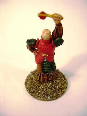
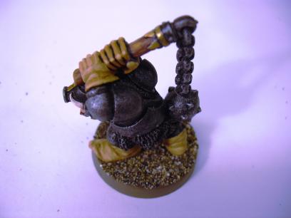
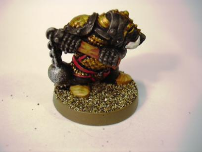
For me, the future is probably a hybrid style, like the Chronopia Dwarf here.
The Verdict
The time has come, dear readers (those who got this far), to render your verdict. Have I learned anything, or is this
all just hopeless? Please use the vote button to register your views. The comments box remains an option for those
who can still use a keyboard or other
character entry device. The technical
department tells me the system is yet unable to receive audio abuse, sorry about that.
Comments
| Nice |
guest |
Jun 06, 2006 15:46 |
Good review, I've got the book myself and largely agree. For armour etc I think I'll stick with washes, for normal painting, I'm going to be trying the three colour method.
"Washing is mentioned only very briefly, glazing and blending neglected completely... "
I thought that at first but then realised it's because they aren't used in the painting method described in the book.
Dewbakuk |
| Good stuff |
guest |
Jun 06, 2006 19:09 |
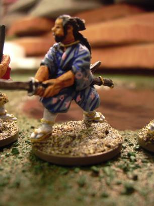
My favoutite is the chap in blue with the robe you don't like. I think it has a good silk look to it.
Personally I use washes, drybrushing and three (or more, or less) colour painting; there's nothing wrong with usig every technique you know when you paint a figure.
I think your Samurai are excellent.
-Matakishi |
| Methods in the book |
maxxon |
Jun 09, 2006 13:15 |
Yes, the book is very much a treatise on a specific method, not a general painting guide with many different methods.
It feels a bit like a cook book with only stir-fry recipes.
Very good, but not an end-all be-all of painting guides. |

This work is licensed under a Creative Commons Attribution-NonCommercial-NoDerivs 2.5 License.
Copyright 2003-2021 Mikko Kurki-Suonio
 Sucks!